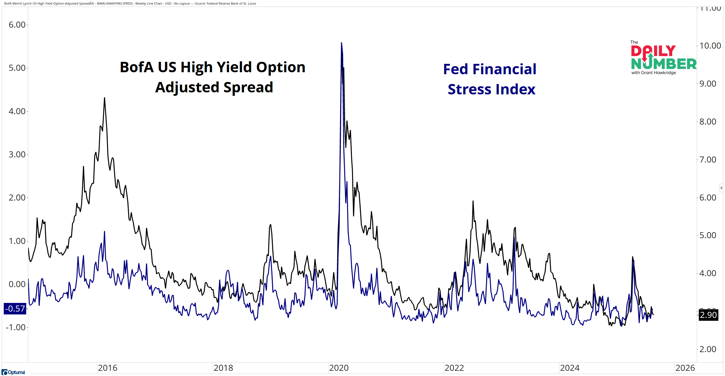
These are two key stress metrics I follow — the BofA US High Yield Option-Adjusted Spread and the St. Louis Fed Financial Stress Index — and they’re near their lows, telling me there’s not much stress in the market.
Here’s the chart:
Let's break down what the chart shows:
The black line represents the BofA US High Yield Option-Adjusted Spread — the extra yield investors demand to hold high-yield corporate bonds over Treasuries.
The blue line represents the St. Louis Fed Financial Stress Index, which combines 18 data series, including interest rates, yield spreads, and volatility measures.
The Takeaway: Both of these metrics track the same thing in different ways — how much stress is in the financial system.
The high-yield spread rises when investors demand more yield to own risky corporate debt, which signals growing credit risk and tighter conditions. When it falls, it’s a sign of confidence and easy liquidity.
The Fed Financial Stress Index works on a similar scale: above zero means more strain than usual, below zero means markets are looser than average.
Right now, both are sitting near their lows.
And that’s important for stocks, because stress in credit usually appears before weakness in equities.
If these measures were turning higher, it would be an early warning that the risk backdrop was shifting.
Instead, they’re still pointing to easy conditions, which have historically supported risk-on trends.
Until we see that change, I’m treating credit as an ally, not a threat.
Grant Hawkridge | Chief Aussie Operator, All Star Charts
Need a full trading toolkit that actually helps you make moves? All Star Charts Premium gives you daily trade ideas, proprietary scans, and access to our entire analyst team. If you're serious about leveling up your strategy,start here.
If you find my content valuable, I would greatly appreciate it if you could share it with your friends, family, and colleagues. Your help in spreading the word is invaluable in supporting our work. Thank you to all of you who share!