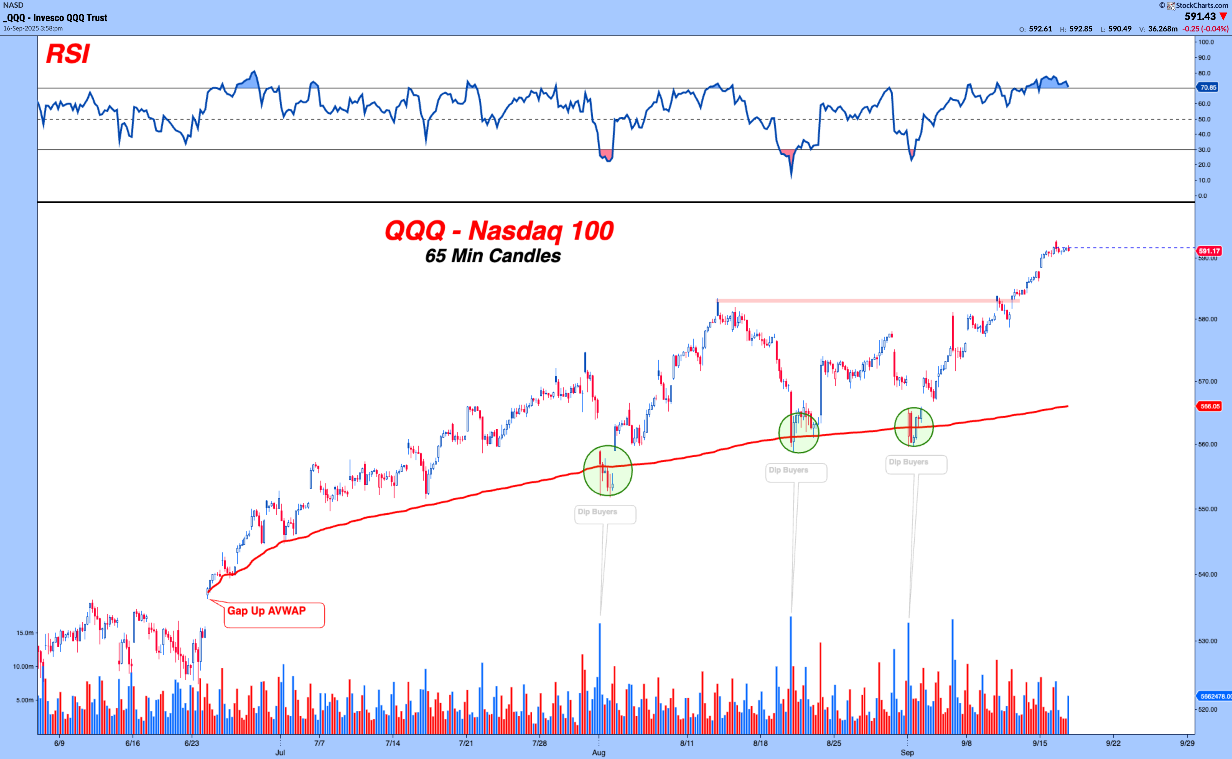
Larry Thompson The Charts Talk Are You Listening? September 16, 2025 A picture might be worth a thousand words, but a good chart can save you from reading them.It compresses the collective wisdom of millions of buyers and sellers into something you can process in seconds.Just look at the recent activity in the Nasdaq 100. $QQQ - Nasdaq 100 (Short Term View) I’m using 65-minute candle, sounds odd, but here's the math. The U.S. equity session runs from 9:30 a.m. to 4:00 p.m. That’s 6.5 hours, or 390 minutes. Divide that evenly into 65-minute bars and you get six candles per day. A clean, consistent breakdown of the trading day.But enough nerd talk. Look at what jumps out.Every time we got back to the June Gap-Up AVWAP, buyers stepped in.Over… and Over… and Over Again.Not just casual buying, but volume surges. Dip after dip, buyers defended the line.You’ll hear “buy the dip” talked about endlessly in articles, podcasts, and social media threads.Thousands of words spilled. But this one chart says it all in an instant.The question isn’t whether charts talk. The question is.......are you’re listening?Anyways, that’s my two cents. Filed Under: $QQQ Share Article