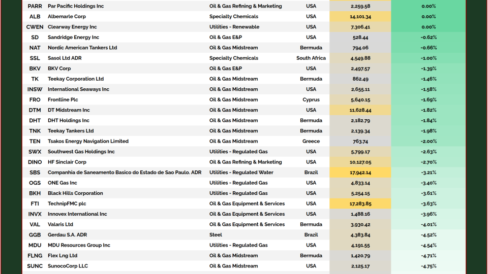
Everyone keeps assuming the Fed is done. That rates peaked in 2023. That the next move is down. That the cycle has run its course and we’re heading back to easy money.
But here’s the thing: the market says otherwise.
The 30-year yield has been grinding higher for most of 2025—not violently, not emotionally, just relentlessly.
Quiet pressure. And when you see that kind of persistent strength at the long end, while the Fed Funds rate sits frozen? That’s not noise. That’s not a shrug. That’s a message.
And this pattern? We’ve seen it before.
In 2018, the Fed hiked into weakness. The 30-year had already peaked, already started to roll over. The bond market was waving red flags. Powell didn’t listen. They pushed one step too far, broke the system, and were forced to reverse course.
The market knew first. The Fed caught up too late.
Then in 2024, it happened again—only flipped.
The Fed started cutting. But the 30-year? It didn’t follow. It rose. Why? Because that cut wasn’t about collapsing demand. It was...
We’ve spent the better part of this year highlighting one breakout after another against the Greenback. The evidence is everywhere you look.
Emerging-market currencies, developed-market FX, precious metals, and international equities. All these things are working.
This is more than just a handful of datapoints. It’s textbook intermarket behavior. And it’s what a weak dollar cycle looks like.
If you’re still trying to figure out where to put your money when the Dollar’s trending lower, you don’t have to guess. History has made it clear:
This is the All Star Charts Weak Dollar Composite, a custom index we built to track this basket of assets. They all have one very important thing in common: they outperform when the Dollar is falling.
See how tight that inverse relationship is?
When the Dollar is in bullish regimes, these assets take a back seat. When the Dollar is in a bearish regime, they tend to lead.
And it’s not just this cycle. You can zoom out forever and see this intermarket action repeat throughout history. We’ve seen it before...
Our Equal-Weight Precious Metals Index is printing fresh all-time highs, marking what we believe is the beginning of a new secular uptrend.
Miners are starting to lead.
Risk appetite is returning.
And short sellers? They’re getting squeezed.
This week, we’re reviewing the latest breakout setups in the metals space, including a small-cap Silver name retesting a key level with explosive upside potential.
Our Precious Metals Index is climbing out of a 14-year base 👇
Every major commodity boom of the last 25 years has followed the same blueprint:
🔺 CRB Index starts curling higher 🔺 Yield curve inverts… then steepens 🔺 And commodities don’t just rally—they detonate.
Look at the chart.
2001 → Inversion → Steepening → Oil +300% 2006 → Same setup → Same outcome 2020 → Rinse and repeat
And now?
It’s happening again.
The CRB is coiling just beneath multi-year resistance. The kind of tight, coiled spring that doesn’t let go gently. Momentum is building. The yield curve—the most reliable forward indicator we’ve got—is turning up from historic depths.
This isn’t some lagging inflation print. This isn’t a Fed narrative. This is price. And price is truth.
This is a setup that only comes around a few times in a generation. Most investors sleep through it. They wait for confirmation. They miss it.
But not you.
Hemingway once said bankruptcy happens two ways: gradually, then suddenly. Commodity cycles are the same. They creep. They churn. Then they rip.